The Best Ceramic Glazes for Stamped Pottery: How to Make Your Stamps Pop
You pressed a beautiful stamp into leather-hard clay. The impression was crisp, deep, and exactly what you wanted. Then you glazed the piece, fired it — and the detail practically vanished under a flat wash of color.
This is one of the most common frustrations in stamped pottery, and it has nothing to do with your stamps. It's a glaze problem. The right ceramic glazes for stamped pottery don't just add color — they use the physical texture you've already created to build contrast, depth, and drama that makes stamp impressions read clearly on the finished piece.
In this guide, you'll learn how different glaze types interact with raised and recessed stamp texture, and three specific techniques — the oxide wash wipe-back, underglaze inlay, and contrasting glaze layers — that experienced potters use to ensure their stamps show up beautifully every time.
Why Glaze Choice Makes or Breaks Your Stamp Impressions
A pottery stamp creates two types of surface: raised clay (the ridges and edges around the impression) and recessed clay (the depth of the stamped design itself). For the stamp to read visually after firing, these two areas need to look different from each other.
Glaze is what creates — or destroys — that difference. When liquid glaze is applied to a bisque surface and fired, it behaves like slow-moving liquid: it thins over raised points and pools in lower areas. Some glazes exaggerate this effect dramatically; others flatten it entirely. An opaque glaze applied too thickly, for example, can fill your stamp recesses completely and leave the surface looking smooth and stamp-free.
The global pottery ceramics market was valued at approximately USD 12.3 billion in 2025 and is growing at a 4.4% CAGR through the next decade — meaning more hobbyist stampers than ever are picking up their first pots. Yet almost no one talks specifically about which glazes actually work on stamped surfaces. That's the gap this guide fills.
The core principle is simple: contrast. Your glaze strategy needs to make the recessed stamp areas look visually distinct from the raised clay around them. There are three ways to achieve this — through glaze behavior (breaking glazes), through added color in the recesses (underglaze inlay or oxide wash), or through layering two glazes with different finishes. We'll cover all three.
The 4 Glaze Types and How They Behave on Stamped Surfaces
Before choosing a technique, it helps to understand how different glaze categories interact with texture. Not all glazes are created equal when it comes to stamped pottery.
Breaking / Celadon Glazes — The Natural Stamp Highlighter
Breaking glazes are semi-transparent or translucent glazes formulated to thin out over raised areas and pool in recesses during firing. This is their default behavior — no special techniques required. They do the work of revealing your texture automatically.
The classic example is the celadon family. AMACO's Celadon series, for instance, is specifically described as pooling "beautifully to add vivid accents to textured and carved surfaces." On a deeply stamped piece, a celadon glaze will sit darker in the recessed impression and lighter on the surrounding raised clay, creating exactly the tonal contrast that makes stamps readable. Spectrum's Floating Glazes and AMACO's Opalescent series behave similarly — flowing thin on relief and thick in incised areas.
Breaking glazes are the lowest-effort, highest-reward option for stamped pottery. If you're new to glazing stamped work, start here.
Matte and Satin Glazes — Subtle Drama
Matte and satin glazes don't flow as freely as celadons, so the contrast effect is more subtle. They tend to stay put on both raised and recessed areas rather than dramatically pooling. On their own, they may not highlight stamps as strongly — but they excel as a base layer in a two-glaze strategy (more on this in Technique 3).
AMACO's Satin Matte Glazes are specifically noted to "break slightly over edges and texture," which gives them a gentle highlighting quality. For shallow stamps, this can be enough. For deeper impressions, pair a satin matte base with a more fluid glaze on top.
Glossy Glazes — Bold Color, Tricky Contrast
Opaque glossy glazes deliver vibrant, saturated color — but on stamped surfaces they require care. An opaque glaze applied too thickly buries stamp detail beneath a uniform layer of color. The key with glossy glazes is application thickness: two thin coats instead of one heavy coat, with the first layer especially light over textured areas.
Where glossy glazes shine for stamped pottery is as a bold base underneath a transparent breaking glaze. The opacity of the first layer gives the overall piece a strong color, while the transparent layer on top creates the tonal variation that reveals stamp detail.
Flowing / Reactive Glazes — High Risk, High Reward
Reactive and flowing glazes — such as AMACO's Potter's Choice series or iron-saturate glazes — can create spectacular texture effects on stamped pottery because their fluid movement during firing is influenced directly by surface topography. They collect in recesses, pull thin over raised areas, and often shift color based on thickness.
The tradeoff is unpredictability. These glazes can run significantly if overapplied. Always fire reactive glazes on a catch plate, and test on tiles before committing to a full piece. When they work, though, the results on stamped surfaces are extraordinary — genuine variation in color and depth that no smooth surface can replicate.
Technique 1: The Oxide Wash Wipe-Back
This is the most reliable technique for deep, bold stamp impressions and is widely used by professional potters who work with textured surfaces. It works by depositing color specifically inside stamp recesses, then clearing it from the raised surfaces — creating maximum contrast before any base glaze is applied.
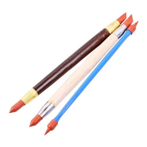
What you need: Iron oxide, cobalt, or copper oxide powder; water; a soft brush; a damp sea sponge; bisque-fired stamped piece.
Step-by-step:
- Mix your oxide with water to a wash consistency — roughly the color of light tea for iron oxide, thinner for cobalt (which is very strong).
- Brush the wash generously over the entire stamped surface of your bisque-fired piece. Work it into the recesses.
- Let it sit for 30–60 seconds until it begins to dry and settle into the stamp impressions.
- Dampen a sea sponge and gently wipe the raised surfaces. The oxide will clear from high points and remain in the recesses. Repeat lightly if needed.
- Let dry completely. Apply your base glaze over the top — a clear, satin, or celadon works well here. The glaze will be transparent enough to show the oxide contrast beneath.
- Fire as normal.
Best oxide colors by effect: Red iron oxide gives warm brown tones in recesses — earthy, aged, and excellent over light-colored or stoneware clay. Cobalt gives a blue accent, subtle at low concentration and deep blue-black when stronger. Copper carbonate gives turquoise-green tones in oxidation firing.
This technique comes directly from centuries of pottery tradition — ancient Chinese and Islamic potters used cobalt oxide washes in recessed areas before transparent glaze for exactly this reason. It remains one of the most effective tools a modern stamper has.
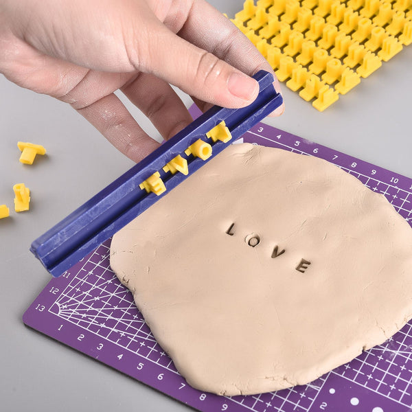
Technique 2: Underglaze Inlay
Where the oxide wash wipe-back uses raw materials, underglaze inlay uses commercial underglazes — which are easier to control, come in dozens of colors, and are food-safe when fired correctly. This technique gives you precise color placement directly inside the stamp impression.
What you need: Commercial underglaze (AMACO Velvet or Speedball are well-regarded for crisp detail); a soft brush; a damp sponge; bisque-fired stamped piece; clear glaze.
Step-by-step:
- Bisque fire your stamped piece first. The texture will be stable and easy to work into.
- Using a soft brush, paint underglaze over the entire stamped area — aim for 2 coats in the recessed areas, working the underglaze down into the impression.
- Allow to dry for about 1–2 minutes. You want it dry but not fully cured.
- Dampen a sponge and wipe the raised surfaces firmly. Underglaze will stay in the recessed stamp lines; the raised clay will wipe clean.
- Let dry completely. Apply a clear glaze over the top to seal, brighten the underglaze color, and make the piece food-safe.
- Fire to the temperature recommended for your clay body and glaze.
Pro tip: Teal and black underglazes have the most visual punch against light clay — they give sharply readable stamp impressions. If you're working on dark clay, try white or cream underglaze in the recesses for a reverse contrast effect.
One thing to watch: some underglazes smudge when you apply clear glaze over them with a brush. If this happens, apply the first coat of clear glaze very lightly and let it dry before adding a second coat. Alternatively, spray your first clear layer, or fix the underglaze with a light mist of hairspray before glazing — it burns off cleanly in the kiln.
Technique 3: Contrasting Glaze Layers
This approach uses two glazes with different visual properties — typically a more opaque base and a more transparent or fluid top — to build both color and texture contrast simultaneously. It's more advanced than the previous two techniques but can produce stunning results on deeply stamped surfaces.
The basic strategy:
- Apply 2–3 coats of your base glaze. This should be a relatively stable, opaque or semi-opaque color. AMACO Satin Matte or a solid color from any mid-fire line works well.
- Once dry, apply 1–2 coats of a transparent or flowing top glaze over the entire surface. A celadon, clear, or reactive glaze is ideal. The top glaze will naturally thin over raised areas and pool in stamp recesses, creating tonal variation over the base color.
- Fire as directed for both glazes — always confirm firing temperatures are compatible.
Classic pairing examples:
- White satin matte base + teal celadon top: the celadon pools dark teal in stamp recesses against a lighter white-teal raised surface.
- Terracotta slip or dark clay body + clear celadon over: the warm clay color shows through the transparent glaze on raised areas; the recesses read darker where glaze pools.
- Matte opaque base + AMACO Potter's Choice reactive glaze on top: the reactive glaze moves and shifts color based on thickness, creating unpredictable but often beautiful stamped effects.
Important: Always test glaze combinations on tiles before applying to a finished piece. Two stable glazes can run unexpectedly when layered — if a combination moves significantly, apply the top glaze more thinly and fire test pieces on a drip-catch plate.
Quick Reference: Matching Your Stamp Style to the Right Glaze Strategy
| Stamp Type | Stamp Depth | Best Glaze Strategy | Good Starting Products |
|---|---|---|---|
| Signature / maker's mark | Shallow | Oxide wash wipe-back or underglaze inlay | Iron oxide wash + clear glaze; AMACO Velvet underglaze |
| Decorative pattern stamp | Medium | Breaking / celadon glaze alone or over underglaze inlay | AMACO Celadon series; Spectrum Floating Glazes |
| Deep texture stamp / roller | Deep | Contrasting glaze layers or reactive glaze | AMACO Potter's Choice; Coyote reactive glazes |
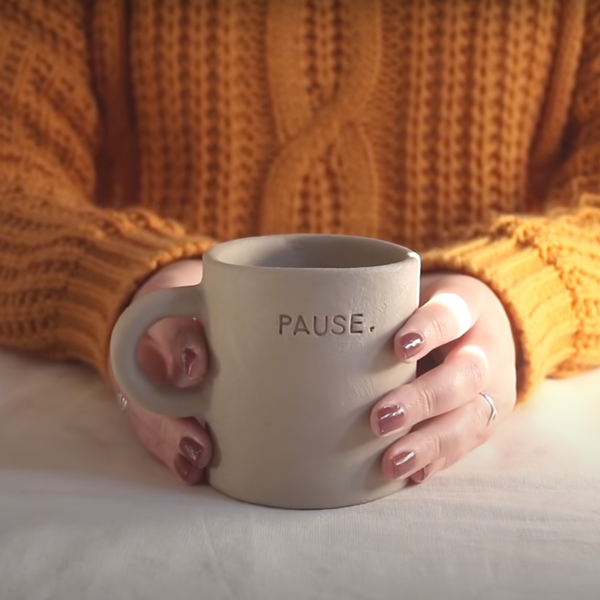
| Letter / text stamps | Medium–Shallow | Underglaze inlay (most legible result) | Black or teal AMACO Velvet + clear glaze on top |
| Nature / botanical stamps | Medium | Oxide wash wipe-back (preserves organic feel) | Copper wash + earthy matte glaze over |
Common Mistakes That Make Stamp Impressions Disappear
Even the right glaze can bury your stamps if applied the wrong way. Here are the most common errors and how to avoid them.
Glaze coat too thick. This is the number one culprit. A heavy glaze application fills stamp recesses completely, eliminating any tonal contrast. For stamped work, aim for thinner, more even coats — especially the first layer. If dipping, 3 seconds of submersion is usually enough. If brushing, two light coats are better than one heavy one.
Opaque glaze on shallow stamps. An opaque glaze has no transparency, so the stamp depth can't create tonal variation through the glaze. Use an oxide wash or underglaze inlay first to add color contrast directly into the recesses, then use the opaque glaze as a background over the top — or switch to a transparent or semi-transparent glaze entirely.
No contrast between clay body and glaze. A light matte glaze over light-colored clay over a shallow stamp creates almost no visual differentiation. Either choose a clay body and glaze combination with inherent contrast, or use one of the three techniques above to introduce color contrast manually.
Skipping test tiles. Stamped surfaces interact with glaze differently than smooth ones, and the difference only becomes clear after firing. Test every new glaze or combination on a stamped tile before using it on a full piece. It takes thirty minutes and can save hours of work.
Conclusion
Your stamps deserve to show up. The detail you pressed into that clay shouldn't vanish behind a coat of glaze — it should be the centerpiece of the finished piece.
The key takeaways from this guide are straightforward. Breaking and celadon glazes do the contrast work automatically, making them the simplest starting point for stamped pottery. The oxide wash wipe-back gives bold, reliable contrast for deep stamp impressions without complicated layering. Underglaze inlay is the most precise technique, ideal for text, signatures, and detailed pattern stamps. And when you're ready for more dramatic effects, layering a stable opaque base with a transparent or reactive top glaze can produce results that genuinely look professional.
Start with one technique on test tiles, document what works, and build from there. The interaction between glaze and stamped clay is one of the most rewarding things to explore in pottery — and now you have the framework to approach it intentionally rather than by accident.
Ready to try it? Browse Stampty's ceramic glaze collection and pair your glazes with our pottery stamps to start experimenting.
Frequently Asked Questions
What is the best glaze for textured pottery stamps?
Breaking glazes and celadon-style transparent glazes are the best choice for stamped pottery because they pool in recessed stamp areas and thin over raised clay, creating natural contrast. AMACO Celadon series and Spectrum Floating Glazes are popular picks among studio potters for this reason.
Will a clear glaze show my stamp impressions?
Yes, but only if the clay body beneath has visual contrast — such as a dark clay body or underglaze applied in the recesses first. A clear glaze over a plain light-colored clay body on shallow stamps will make the impression almost invisible after firing.
Can I use underglaze directly in stamp recesses?
Absolutely — this is one of the most reliable techniques for making stamps pop. After bisque firing, paint underglaze over the stamped area, let it sit for 30–60 seconds, then wipe the surface with a damp sponge. The underglaze remains in the recessed impressions and wipes clean from the raised clay. Apply a clear glaze over the top to seal.
Does glaze thickness affect how visible stamp detail is?
Yes, significantly. Too thick a glaze coat fills in shallow stamp recesses and buries the detail. For stamped surfaces, aim for thinner, even coats — especially the first layer. Dipping for 3 seconds or brushing two thin coats works better than building up heavy layers.
What is a breaking glaze and how does it work on stamps?
A breaking glaze is a semi-transparent or translucent glaze that thins out over raised areas and pools in recessed ones during firing. This natural behaviour creates tonal contrast directly over stamped texture: the recesses become richer and darker, the raised areas lighter. Celadon glazes are the classic example of this type.