Fine Lines in Clay: How to Design a Pottery Stamp That Makes Delicate Details Actually Work
Every resource on pottery stamp design gives the same advice: start with bold, simple shapes. That is good advice for beginners — but it leaves a significant gap. As your practice grows and your aesthetic becomes more refined, you may find yourself drawn to something different: a single botanical stem, a delicate geometric outline, a maker's mark with the elegance of a fine-liner pen pressed into clay.
The problem is that fine line pottery stamp design operates by completely different rules than bold stamp design. What looks beautiful on screen can disappear entirely in fired clay, or worse — smear into an unreadable blur. Understanding why this happens, and how to design around it, is the difference between consistently stunning results and chronic frustration.
This guide covers the physics, the clay science, and the precise design decisions that make delicate impressions work reliably — every time.
Why Fine Lines Are Harder Than They Look
Clay is not paper. When you press a stamp into it, you are not transferring ink onto a static surface — you are physically deforming a material that is alive, responsive, and in the process of drying. Clay moves. It sticks. It shrinks by 10–15% during firing. And all of that movement is unkind to delicate details.
Bold designs are forgiving because they rely on large, simple forms that retain their identity through the entire process: stamping, drying, bisque firing, glazing, and glaze firing. A thick line that loses half its width to glaze pooling is still a thick line. A 1mm line that loses half its width is invisible.
Fine-line stamp design is therefore a problem of margins. Every step in the ceramic process takes a small toll on detail. Success means designing with enough precision and understanding of those losses that something beautiful survives to the end.
The Physics of a Fine-Line Impression
When a stamp makes contact with clay, two things happen simultaneously: the raised elements of the stamp push the clay downward and outward, and the clay pushes back with resistance proportional to its moisture content and thickness.
For bold designs, this interaction is straightforward — the stamp displaces the clay cleanly, and the walls of the impression hold their shape as the clay firms. For fine lines, the physics become more precarious.
A fine groove cut into a stamp is a narrow channel. When pressed into clay, the clay needs to be soft enough to flow into that channel and hard enough not to collapse back out of it when the stamp lifts. Too wet and the clay walls of the groove slump inward the moment pressure releases — you get a soft, blurred impression rather than a crisp line. Too dry and the clay doesn't accept the stamp at all, producing a shallow or absent mark.
The depth-to-width ratio of a fine line also matters. A line that is 1mm wide and 2mm deep will hold its shape reliably. A line that is 1mm wide and 0.3mm deep will be filled by even a thin glaze coat. For fine-line pottery stamps to survive through glaze firing, the design needs not just narrow lines but lines with enough depth to remain legible after glazing.
Precision-engraved stamps — whether laser-cut acrylic or machined brass — solve the depth problem because they can reproduce the exact depth specified in the design file, consistently, across every line in the composition. Hand-carved stamps introduce variability in depth that compounds the challenge of fine lines significantly.
Clay Consistency: The Variable Nobody Mentions
Most pottery stamp guides focus on design. The most impactful variable, however, is one that arrives before the stamp even touches clay: moisture content.
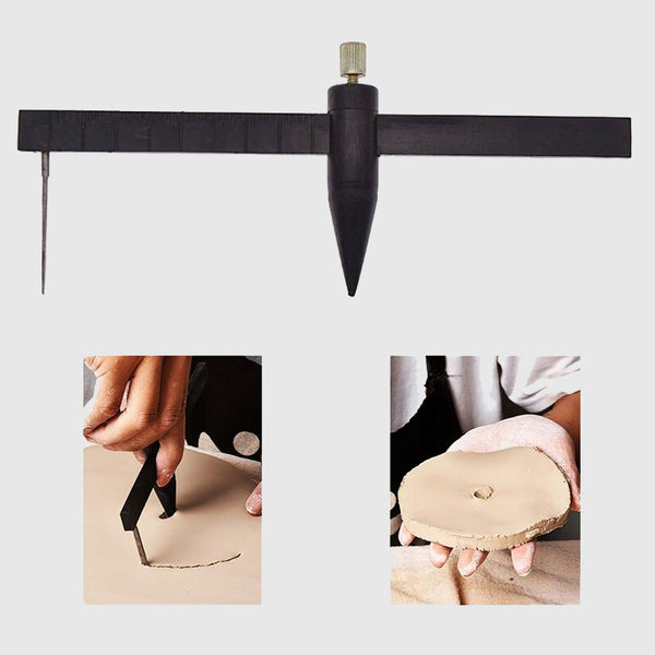
Leather-hard is the sweet spot for fine-line stamping — essentially every experienced potter and stamp maker says this, and the reason is physics. At leather-hard stage, the clay has dried enough to hold its shape under pressure (somewhere around 15% moisture content remaining). The surface accepts an impression cleanly, the walls of fine grooves hold without collapsing, and the stamp releases without dragging clay along with it.
How do you know when your clay is at leather-hard? The surface should be cool to the touch but not cold (still has residual moisture), the clay should hold its shape without sagging under its own weight, and pressing your thumbnail into the surface should leave a mark but not a deep impression. If it feels like soft cheese, it's too wet. If it sounds hollow when you tap it, it's too dry.
For fine lines specifically, erring toward the slightly firmer end of leather-hard is almost always better. A drier surface means the fine grooves don't smear as the stamp lifts. The impression will be shallower — but it will be crisp. Shallow and crisp beats deep and blurred every time.
Clay body also matters. Fine grog or sand particles in coarser clay bodies can interrupt the clean edges of a fine line. Smooth, fine-particle clay bodies — porcelain and fine stoneware in particular — are the natural home of fine-line stamp design. The same design that disappears into a rough stoneware will read clearly in porcelain.
Designing for Fine Lines: The Rules
Understanding the clay science translates directly into design decisions. These are not arbitrary preferences — they are the specific constraints that the stamping process imposes on fine-line work.
Minimum line width: 1–1.5mm in the finished fired piece. Because clay shrinks 10–15% during firing, your stamp needs to be sized up accordingly. If you want a 1mm line in the fired piece, the stamp needs to cut at 1.1–1.15mm. When designing in vector software, set your minimum stroke width at 3pt (approximately 1.06mm at 72dpi) as an absolute floor — and lean toward 4pt for work with less-than-perfect conditions.
Spacing between lines matters as much as line width. Two fine lines that are too close together will merge into a single, muddled groove under stamping pressure. The gap between parallel fine lines should be at least equal to the line width itself — so 1mm lines need at least 1mm of space between them. This is the rule most often violated, and it's the primary cause of "textured blob" failures in fine-line grid and cross-hatch designs.
Isolated lines outperform dense line fields. A single botanical stem with one fine line performs far better than a grid of ten parallel fine lines. The more lines a design contains, the more precisely conditions need to be perfect for all of them to read clearly. Elegant restraint is not just an aesthetic preference in fine-line stamp design — it is a technical strategy.
Positive and negative space relationships change under pressure. In a digital design, positive (filled) and negative (empty) areas look equally defined. In clay, the stamp pushes clay down in the positive areas and leaves it untouched in the negative areas. This means negative space can appear to "grow" slightly as clay flows outward from impression — designs with generous negative space between fine elements are more forgiving than those where elements sit close together.
Account for shrinkage in the overall stamp size, not just individual lines. If your finished stamp needs to fit inside a 30mm diameter foot ring, order a stamp approximately 34mm in diameter (30 ÷ 0.88, for a clay body with 12% shrinkage). Most custom pottery stamp suppliers can advise on the right size if you tell them your clay body's shrinkage rate.
Design Styles That Thrive as Fine-Line Stamps
Some design approaches are simply better suited to fine-line stamp work than others. These are the styles where thin lines succeed most consistently.
Single botanical elements. A lone stem, a seed head, a single leaf with fine veining — these work because the fine lines are isolated, surrounded by open space, and the overall composition is simple enough that even slight imperfections in individual lines don't compromise the reading of the whole. A sprig with three branches reads clearly even if the smallest branch impression is slightly soft. Botanical line work has the additional advantage that its handmade character suits the ceramic medium perfectly.
Minimal script or initials. One word in a clean, open hand-lettered style or a single monogram letter with delicate serif detailing can read beautifully as a fine-line stamp — provided the letterforms are open rather than condensed, and text height is at least 4mm in the stamp (which will fire down to roughly 3.5mm). Script that is too compressed sees letterforms merge; script that is too small disappears under glaze.
Geometric outlines with interior detail. A circle with a single fine-line cross inside it. A triangle with one internal line of hatching at a generous angle. The outer geometric form — bold enough to anchor the design — gives the fine interior lines visual context, and the eye reads the composition as a whole even when individual fine lines are slightly imperfect.
Ma-inspired compositions. Ma is the Japanese concept of meaningful negative space — the pause, the gap, the emptiness that gives form to what surrounds it. Pottery designs inspired by this aesthetic use very few fine lines arranged with deliberate, generous spacing. The openness of the composition is the design. These translate to clay with exceptional success because the isolated lines have room to breathe, and the surrounding negative space means even subtle imperfections in the impression are invisible against the untouched clay surface.
What to Avoid — and How to Adapt It
Some design approaches that look compelling in digital form rarely survive the full ceramic process. Here is how to recognize them and what to use instead.
Dense cross-hatching. The parallel lines in a cross-hatch are close together by definition, and the crossing points where two lines intersect create small isolated clay islands that are prone to smearing. Replace with an open grid — lines spaced 3mm or more apart, so each line reads independently — or with a single directional hatch at a generous spacing.
Serif fonts at small sizes. The hairline serifs on many typefaces (the small decorative strokes at the ends of letters) can be as thin as 0.3mm in a design scaled for a typical maker's mark. These simply do not survive stamping at any clay consistency. Either switch to a geometric sans-serif at the same size, or increase your type size significantly so the serifs are at least 0.8–1mm thick. Alternatively, use a calligraphic style where thick and thin strokes are intentionally exaggerated — the contrast can work, but only when the thickest strokes are bold enough to anchor the composition.
Overlapping fine lines. In illustration or printmaking, overlapping lines create depth and shading. In clay stamps, overlapping lines create areas of dense, unresolvable texture. Add generous breathing room between all elements — more than looks necessary on screen — because stamping pressure will close the gaps.
Gradient-style shading. Stippling, hatching used to suggest tone, or any approach that uses line density to imply value change does not translate to clay. Replace with clean outline only. The three-dimensionality of the impressed mark and the way glaze pools in the grooves will create its own tonal variation without any shading in the design.
How Glaze Interacts with Fine Lines
Even a perfectly executed fine-line stamp impression can be partially erased by glazing. Understanding this interaction lets you design and apply glaze accordingly.
Glaze is liquid when applied and flows before it melts in the kiln. This flow fills the lowest points of a surface — which are exactly where your stamp impressions are. Thick, fluid glazes can fill a 1mm impression entirely, leaving the fired surface smooth and the stamp mark invisible. This is the primary killer of fine stamp work after bisque firing.
Three approaches protect fine-line impressions through glazing. First, apply glaze thinly over stamped areas — two thin coats rather than one thick coat, or dip briefly and let dry rather than dipping and dipping again. Second, use a transparent or slightly translucent glaze over stamped areas rather than a thick, opaque one; transparent glazes allow the depth of the groove to show through rather than filling and obscuring it. Third, use wax resist applied directly to the stamped mark before dipping; the wax prevents glaze from pooling in the impression, and burns away cleanly in the kiln, leaving the fine lines crisp and unglazed against the surrounding glazed surface — a beautiful contrast effect.
The depth of your stamp's engraving matters significantly here. A stamp with 1–2mm of engraving depth creates grooves deep enough to remain at least partially visible even through a coat of glaze. Shallower engravings are vulnerable. When ordering a custom pottery stamp specifically for fine-line work, specify the deepest available engraving option.
Stamp Material: Acrylic vs. Brass for Fine Detail
Not all stamp materials handle fine lines equally, and the choice of material has a direct impact on how well your delicate design translates to clay.
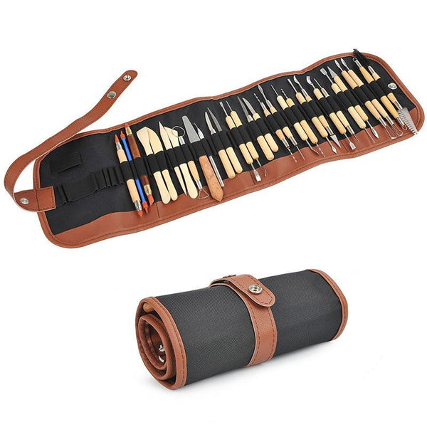
Laser-cut acrylic is the dominant material for custom pottery stamps today, and for good reason. Laser cutting can reproduce fine lines with exceptional accuracy — the laser beam width determines the minimum reproducible detail, typically 0.1–0.2mm on a professional laser cutter. The resulting stamp surface is smooth and non-porous, which reduces clay adhesion significantly. This matters for fine-line work because thin walls of clay in the grooves are more susceptible to sticking than the broad walls of bold impressions. Stampty's custom pottery stamps are made from precision laser-cut recycled clear acrylic, and the transparency of the material also allows you to see exactly where the stamp is positioned before pressing — a genuine advantage when fine detail placement matters.
Brass stamps machined via CNC offer the sharpest possible edge definition for extremely fine work. The hardness of brass means the engraved walls do not deflect under repeated stamping pressure, which maintains consistent line width impression after impression — important for production potters who stamp the same design hundreds of times. The trade-off is cost (brass stamps typically cost significantly more than acrylic) and the non-transparent body, which makes alignment a matter of experience rather than sight.
3D-printed stamps are the weakest option for fine-line work. The layer-by-layer printing process introduces surface texture that interrupts fine-line edges, and the resolution of most 3D printers is insufficient to reproduce lines thinner than approximately 1.5–2mm reliably. They can work well for bold designs, but fine-line work benefits from the precision of laser cutting or CNC machining.
| Material | Minimum reproducible line | Clay release | Fine-line performance | Best for |
|---|---|---|---|---|
| Laser-cut acrylic | ~0.2mm (practical: 0.8mm+) | Excellent (smooth, non-porous) | Very good | Most fine-line work, maker's marks, botanical designs |
| CNC brass | ~0.1mm (practical: 0.5mm+) | Good with release agent | Excellent | Ultra-fine detail, high-volume production |
| 3D printed | ~1.5mm practical minimum | Variable (surface texture) | Limited | Bold designs only |
Technique: Getting the Fine-Line Impression Right
Even a perfectly designed stamp on perfectly timed clay can produce poor results with careless technique. These four principles are especially important for fine-line work.
Use a release agent. A light dusting of cornstarch or a thin film of vegetable oil on the stamp face before pressing reduces the adhesion between stamp and clay. For fine lines, this matters because the narrow walls of the grooves offer very little mechanical separation — a release agent is what allows the stamp to lift cleanly without dragging. Apply the release agent lightly and evenly; excess cornstarch can leave a powdery residue in deep impressions.
Apply less pressure than you think you need. The instinct is to press hard to get a deep impression, but fine lines need controlled, even pressure — not maximum force. Excessive pressure on a fine-line stamp causes the clay between elements to over-deform, closing the narrow negative space gaps that give fine lines their definition. Press until you feel the stamp make full contact with the clay surface, then stop. For Stampty's acrylic stamps with their smooth surfaces, the stamp's own weight plus gentle hand pressure is often sufficient on leather-hard clay.
One confident press, straight down and straight up. Rocking the stamp during pressing — even slightly — can cause a double impression on fine lines. Because the lines are so narrow, even a 0.5mm lateral shift during pressing creates a ghost line beside the real one. Position your stamp carefully, press with a single confident motion, and lift straight back up without any rotation or drag.
Clean the stamp between impressions. Clay residue builds up in fine-line grooves after each use and progressively degrades impression quality. For production stamping, clean the stamp every three to five impressions with a damp cloth or soft brush. For very fine details, a soft toothbrush and warm water after each session maintains the precision of the engraved lines session after session.
Order Your Custom Pottery Stamp
If you are ready to translate a fine-line design into a custom pottery stamp, Stampty's precision laser-cut acrylic stamps are built for exactly this kind of work. The clear acrylic body lets you see your design's exact placement before pressing, the smooth non-porous surface releases cleanly from clay — essential for fine-line work — and every stamp comes with a reclaimed wood handle for stable, centered pressure.
Upload your design, specify your clay body and shrinkage rate if you want size-adjusted advice, and your custom stamp will be precision-cut to your exact specifications. Order your custom pottery stamp at Stampty and press your finest work into every piece.
Frequently Asked Questions
What is the minimum line width for a pottery stamp design?
For a custom pottery stamp, lines thinner than 1mm are unlikely to survive the stamping process reliably. At leather-hard clay consistency, lines between 1–1.5mm are achievable with proper technique and a precision-cut acrylic or brass stamp. Always account for 10–15% clay shrinkage during firing, which will reduce your line width slightly in the finished piece.
Why do fine lines in clay stamps get blurry or disappear after firing?
Three things cause this: first, the clay was too wet when stamped, so line edges smeared before they set. Second, the glaze was applied too thickly and filled the grooves. Third, the design lines were simply too narrow to survive both the stamping and glazing process. Using leather-hard clay, a thin transparent glaze layer, and lines of at least 1mm width dramatically improves survival rate.
Can I use a fine-line design as a pottery maker's mark?
Yes — and a well-designed fine-line maker's mark is often more distinctive than a bold one. The key is keeping the design legible at stamp size (typically 25–40mm): use open, uncluttered compositions, avoid text smaller than 4mm tall, and choose a stamp material with precision engraving. A single botanical sprig, a minimal initial, or a clean geometric outline all make excellent fine-line maker's marks.
Does glaze fill in fine stamp impressions?
Yes, thick glaze can partially or fully fill a shallow fine-line impression, making it invisible in the fired piece. To protect fine lines: apply glaze thinly over the stamped area, use a transparent or semi-transparent glaze rather than an opaque one, and consider wax resist over the stamped area before dipping. A minimum impression depth of 1–2mm helps lines survive a glaze coat.
What design styles work best for fine-line pottery stamps?
Designs that excel as fine-line pottery stamps include: single botanical stems or seed heads with open spacing between elements, minimal monograms or single initials in a clean style, geometric outlines with one or two interior fine-line details, and compositions that use generous negative space deliberately. Avoid dense cross-hatching, small serif fonts, overlapping fine lines, and anything that relies on gradient or shading.